Monthly Archives: October 2016

Image and text. Exercise 1

Cut some pictures from a newspaper and write your own captions.

  • How do the words you put next to the image contextualise/re-contextualise it?
  • How many meanings can you give the same picture?

recipe_000017

This is an example of ‘relay’, that is, the words and the image have equal value. They are completely interdependent.
Other (less successful) captions could be:-

“You don’t scare me!”

“Davies or kids – who scares you most?”


MourinhoThe same cannot be said of this photo of Jose Mourinho. It’s not clear which of the three people is the subject of the shot. The text ‘anchors’ the meaning and fixes Mourinho in the frame.
Other tags could be:-

“Mourinho puts on his game face.”

“Another photobomb.”


The Jungle

The text and accompanying story fix the meaning of the image.
Other tags could be:-

“Publicity shot for a film called ‘Postapocalyptic”

“Overcooked in PhotoShop.”

In each instance, the text gives the image a context wherein its meaning can be found. Sometimes the meaning of an image can be removed almost completely from its original context. Man Ray’s Glass Tears, for example appeared with this text.
Elton John

The Man Ray image is interesting in its own right but since it’s used in a magazine filled with adverts for expensive things to buy it’s important for the blurb to mention its price and who owns it now. The image has been repositioned in a social, financial and cultural context. Its artistic merit has all but disappeared. It has become an example of an image which “is felt to be weak in respect of meaning” (1)

(1) Barthes, R, Rhetoric of the Image (1964)

Some Thoughts on The Death of the Author. Roland Barthes

recipe_000016
“What I find so difficult to come to terms with is the strain of knowing that whatever we say will reveal something very personal about whoever it is that drew us.”
Apologies to Pyne, Punch 23-09-1981

Barthes says that literature is “the trap where all identity is lost, beginning with the very identity of the body that writes. … Once an action has been recounted … the voice loses its origin.” Barthes also says “the author is a modern figure”. The artist was for centuries an anonymous figure with notable exceptions, Phidias the sculptor, for example, until, as Barthes claims, the Reformation “discovered the prestige of the individual” so that “the explanation of the work is always sought in the man (sic) who produced it.”

This is to say what has always been the case. Once a work of whatever kind is out in the wild and beyond its originator’s control, the originator becomes irrelevant. They can no longer add to or subtract from it. Even ‘witting testimony’ whether it be Tacitus’ or Julius Caesar’s books, or Bede’s or Macaulay’s histories, must take its place in the time, context and culture which produced it and becomes ‘unwitting testimony’ once it is released into the world. (1)

Even though we remember the names of some authors, architects or artists, in the end it is their work we have to deal with. “Once the Author is gone,” says Barthes, the claim to ‘decipher’ a text become quite useless.” We have to deal with the text, work of art, whatever, as it is in our own time without constantly referring to its origins. So, Shakespeare is endlessly interpreted for our own times. A third century arch in Diocletian’s palace has a 1960’s apartment built on top of it. Some of the recommendations of the Communist Manifesto have been reinterpreted and put into practice. We have progressive income tax, control of inheritance, a central bank, free education, and the abolition of child labour, for example. We do not need to know about Dorothea Lange in order to understand her image of the migrant mother (though the events depicted are recent enough for that to be useful). The origin of these things may be of academic interest or largely forgotten. The reader, the consumer of works, is set free from the author. Barthes concludes, “the birth of the reader must be ransomed by the death of the Author.”

(1) cf. Marwick, A, The Fundamentals of History. www.history.ac.uk/ihr/Focus/Whatishistory/marwick1.html

Notes on Briony Campbell’s Dad Project and W. Eugene Smith’s The Country Doctor

W. Eugene Smith (1) spent 23 days following Dr. Ernest Ceriani, the only doctor in 400 square miles with a population of 2,000 people. He made 38 images. The chronological order of the images is less important than the impression he creates of an incredibly dedicated and hardworking country doctor who has to deal with everything from midwifery to amputations, heart attacks to broken bones. The images say nothing about his motivation but everything about his commitment to helping others and serving his community. The intimacy of W. Eugene Smith’s photographs takes the viewer/reader right into the heart of the doctor’s work. This image is typical.

w-eugene-smith-country-doctor-14
“Dr. Ceriani has stitched the girl’s wound to minimize scarring, but he must find a way to tell the parents that her eye cannot be saved and they must take her to a specialist in Denver to have it removed.”

Briony Campbell (2) spent the last six months of her father’s life recording, preserving and perhaps in Susan Sontag’s word, ‘consecrating’ his end and her feelings about it. (3) She had a great deal of control over the images she made and the way they were presented with the exception of how they appeared in Die Zeit where the journalist inserted him/herself into the account. Her original intention was to preserve the story of her father’s death from pancreatic cancer but once the work was out in the world there was a chance that she and her father would become, again in Sontag’s terminology, ‘victims’ of the photograph. Her commentary is vital to understanding the series. The commentary reveals her explicit intentions.

W. Eugene Smith simply captioned his images. He has kept himself completely out of the picture. His intention is straightforward – to inform, educate and, in a way, to entertain. Briony Campbell communicates a coping mechanism and offers an invitation to share an experience.

Her project is ‘an ending without an ending’ because the events leading up to her father’s death are now permanent and can be revisited at any time by any number of people.

image
“When we said goodnight on his last lucid day, he said; ‘Think about what we should shoot tomorrow for the project’.
By tomorrow his shine was gone and just his shape remained – His unconscious contribution”

(1) http://time.com/3456085/w-eugene-smiths-landmark-photo-essay-country-doctor/?iid=sr-link1

(2) http://www.brionycampbell.com/wp-content/uploads/2013/03/The_Dad_Project_Briony_Campbell.pdf

(3) in La Grange, A. (2005) Basic Critical Theory for Photographers. Oxford: Focal Press

The differences between documentary, reportage, photojournalism and art photography

Documentary photographs need an accompanying text or commentary to provide a context. Narrative on its own is capable of telling what looks like the whole story: images illustrate the narrative. The immediacy of documentary photographs “depends largely on our awareness that the situation they describe is ongoing” (1)

Documentary photography seems to have the same aims as the BBC – to inform, educate and entertain. This is why it has traditionally concentrated on what is foreign, unusual or strange. Much of National Geographic’s output seems to belong in this category.

Documentary may also place the photographer at the centre of the story so that it becomes a form of reportage, especially when it is concerned to draw attention to a social or political situation. When this is the case, however, the written text takes precedence over the image perhaps especially when the text is provided by someone other than the photographer. For example see Kerouac’s introduction to Robert Frank’s The Americans (2)

frank-001-Custom-4

“THAT CRAZY FEELING IN AMERICA when the sun is hot on the streets and music comes out of the jukebox or from a nearby funeral, that’s what Robert Frank has captured in these tremendous photographs taken as he traveled on the road around practically forty-eight states in an old used car (on Guggenheim Fellowship) and with the agility, mystery, genius, sadness and strange secrecy of a shadow photographed scenes that have never been seen before on film”

In reportage the text is paramount. The images attempt to show the truth behind the opinions expressed in the text. Jacob Riis’ How the Other Half Lives is a prime example. He said of the New York slums, “The sights gripped my heart until I felt I must tell of them or burst” (3) This kind of reportage continues today. For example, see Nathan Meyer’s report on Cambodia. (4)

Photojournalism has largely been superseded by television.

Art photography is planned in advance to create particular effects. In the 1850s photographers like Julia-Margaret Cameron planned their images in the same way as painters planned theirs.

I_Wait_by_Julia_Margaret_Cameron
I Wait. Julia-Margaret Cameron

Other images achieve the status of art because of their rarity. Edward Steichen’s The Pond is such an image being bought and sold for large sums of money at art auction. Yet others achieve that status by being placed in an artistic environment, on the wall of a gallery for example, or in an art book. Some images, like this by Robert AdamsEd Ruscha Gas Station

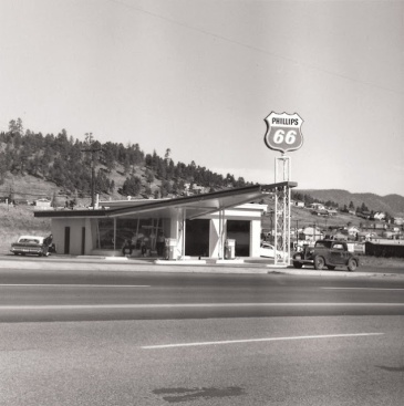
are simple records of places. While others, like this by Ed Ruscha

Robert Adams Gas Station

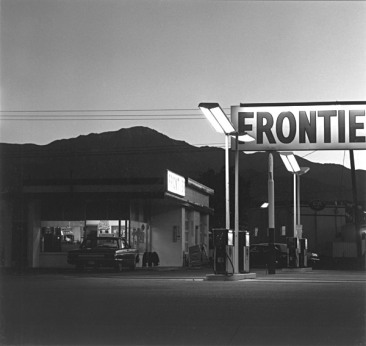
are intended as works of art. “In the case of Adams, it could be said that his work is ‘about’ gas stations, whereas, in the case of Ruscha, it is about the notion of objectivity, and is therefore part of an artistic discourse”. (5) In other words, the image is about whatever the author says it is about as long as they keep control over the environment the image appears in. The context proclaims the work as art and says that the author is an artist. Such images say more about the artist than about the world.

(1) Grundberg, A. (1999) Crisis of the Real (3rd ed.) Aperture.
(2) http://www.americansuburbx.com/2011/01/theory-photographer-in-beat-hipster.html
(3) https://www.youtube.com/watch?v=EACoIbokOcc
(4) http://reportage.co.uk/#/a-country-in-shadows
(5)  Badger, G. (2007) The Genius of Photography: How photography has changed our lives. London: Quadrille Publishing Ltd. 211

Assignment 1 Evaluation

The story is a journey as a tourist around the eastern Adriatic. Out of the hundreds of possible images I chose these few. I rejected pairs like this taken in Malta …

CBW_5827 CBW_5831

(insufficient connection between the images)

and this …

CBW_5774 CBW_5776

(the fish farm doesn’t say enough about the castle on the point)

and this …

CBW_5670 CBW_5674

(neither image is interesting enough though I did enjoy the contrast between the girl in costume and the dozing man, ideal (from the tourist point of view) and ugly in the same frame).

One set of images, the, for want of a better word, ugly set, is just as representative of what was there as the other set. In fact there was more ugly than pretty and a documentary showing the degeneration of ancient cities would be quite feasible while one showing only the commercial side would not show even half the truth. Both would be convincing because both are available to the camera. I looked for the truth and found only images that could be interpreted according to some kind of stereotype or preconceived notion of what makes a good tourist photograph.

All the images are taken from ‘real life’, though I would have like to have taken more pictures of people as I did for Project 3  but the guided tours left me pressed for time and always accompanied by a crowd. (https://christopherwlog.wordpress.com/category/coursework/part-1-the-photograph-as-document/project-3-reportage-part-1-the-photograph-as-document/)

Ignoring the ideas suggested in the brief is risky. The brief assumes scenarios whereas I chose scenes. My set is less immediate and personal but I believe still shows essential ‘truths’.

Images are well exposed and processed. Looking back, I would have preferred to use a much wider aperture to separate the girl selling almonds from her background. The focus in pair #3 of the boy sitting on the pile is perhaps too soft.

I rely on the footnotes to demonstrate research and knowledge.

Assignment 1 Two Sides of the Story

Brief
Create at least two sets of photographs telling different versions of the same story. Make both sets equally convincing so that it’s impossible to tell which version of the images is ‘true’.

Interpretation
The intention behind these images is simply to show what was there. This is an unrealistic intention. The act of selecting a scene, managing the colour, removing lens aberrations, deciding on a frame and so on, means that the images do not show either what the camera saw nor what was there. The images are constructs in the same way as every sight before our eyes is interpreted by age, experience, expectation, physical constraints and conceptual language, in fact, all the elements that make legerdemain more or less successful. Compare these two hotel rooms, for example. Which is the ideal, and which the real?

With these thoughts in mind I moved on to look for contrasts between ideal images and less than ideal images. An ideal image would be well composed and conform to what the imagination might see when presented with the real place.

Once Photoshop is involved, however, images are no longer indexical. Their direct physical relationship to the object, their ‘reality’, has been broken.[i] Of course both images in these pairs are ‘real’. The girl was there and so was the camera. But she was aware of the camera and posed for it: she is not relaxed, she is, in Susan Sontag’s terms, a victim, more or less willing but trapped and presented in a special role for tourists.[ii]  Or maybe she was complicit in creating the image in the same way as a studio model. She knew she was the subject and the background detail was as irrelevant to her as it was to the photographer. It is impossible to tell whether, again in Sontag’s terms, she is ‘looted’, ‘preserved’, denounced’ or ‘consecrated’[iii] by the act of being photographed. There was no time, or common language, or even, at the time, the inclination to discuss such issues with the girl. That’s not what tourists are expected to do. Meyerowitz faced the same existential problem.[iv] Other scenes compare the tourist record with what is seen by turning round or by widening the field of view.

I made these pairs of images.

1.

CBW_5901 CBW_5900

Two views of the same alley in Diocletian’s Palace in Split.

2.

CBW_5497CBW_5398

A window in the Rialto compared with a window in the Doge’s Palace in Venice.

3.

CBW_5456CBW_5451

In Venice.

4.

CBW_5856CBW_5815

Luxury and ‘real’ life in Malta.

5.

CBW_5670cbw_5721

Market in Dubrovnik.

6.

CBW_5496CBW_5488

The Rialto in Venice.

7.

CBW_5509CBW_5513

Venetian canal.


[i] This is why, in the interests of honesty, National Geographic, for example, asks photojournalists to submit RAW files. See http://petapixel.com/2016/07/04/nat-geo-says-committed-honest-photos-era-photoshop/

[ii] in Bull, S, (2009) Photography. Abingdon: Routledge

[iii] in La Grange, A, (2005) Basic Critical Theory for Photographers. Oxford: Focal Press

[iv] http://erikimphotography.com/blog/2014/01/22/12-lessons-joel-meyerowitz-has-taught-me-about-street-photography/

Thinking about Assignment 1

I’m thinking about two sets of travel photographs, one showing ideal views that a tourist might take and another showing scenes that a tourist might ignore. In other words one set will be pretty and the other less so.

To start with, I made these images of places we stayed.

For example, a hotel room might look like this …

CBW_4873

or it might look like this …

CBW_4913

Or a hotel might look like this …

CBW_5264

or like this …

CBW_5344

John Szarkowski in his Introduction to William Eggleston’s Guide wonders whether places themselves, not only the pictures in the Guide, were a work of art. My images are not works of art, nor are the places themselves except insofar as there is an element of design in everything made by people. The intention behind the images is simply to show what was there. This is an unrealistic intention. The act of selecting a scene, managing the colour, removing lens aberrations, deciding on a frame and so on, means that the images do not show either what the camera saw nor what was there. The images are constructs in the same way as every sight before our eyes is interpreted by age, experience, expectation, physical constraints and conceptual language, in fact, all the elements that make legerdemain more or less successful.

With these thoughts in mind I moved on to look for contrasts between ideal images and less than ideal images. An ideal image would be well composed and conform to what the imagination might see when presented with the real place. Like this …

CBW_5721

rather than like this unedited version …

CBW_5721a

Of course both images are ‘real’. The girl was there and so was the camera. But she was aware of the camera and posed for it: she is not relaxed, she is, in Susan Sontag’s terms, a victim, more or less willing but trapped and presented in a special role for tourists.¹  Or maybe she was complicit in creating the image in the same way as a studio model. She knew she was the subject and the background detail was as irrelevant to her as it was to the photographer. It is impossible to tell whether, again in Sontag’s terms, she is ‘looted’, ‘preserved’, denounced’ or ‘consecrated’² by the act of being photographed.

1. in Bull, S, (2009) Photography. Abingdon: Routledge
2. in La Grange, A, (2005) Basic Critical Theory for Photographers. Oxford: Focal Press